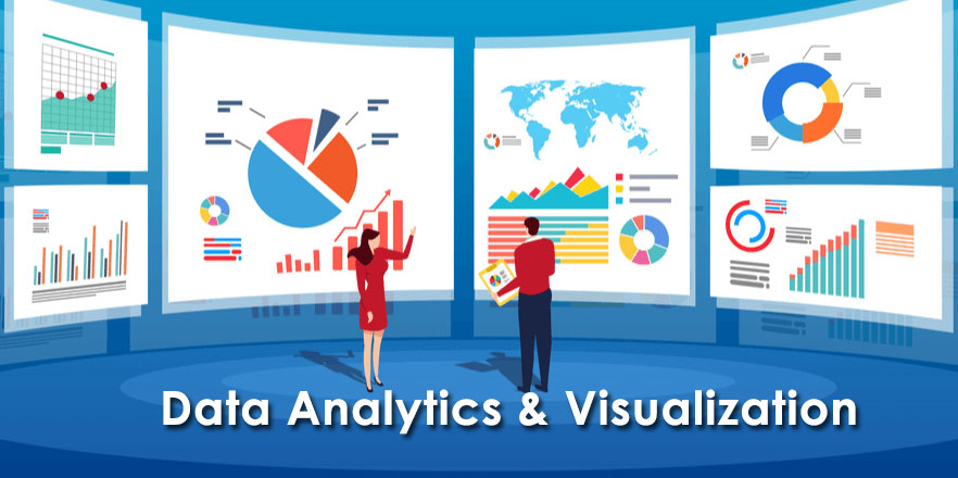
The Data Analytics & Visualization Course provides comprehensive training in Python with a focus on its integration with Power BI for analytics and visualization. Participants will develop expertise in Python programming techniques tailored for Power BI, enabling them to design intelligent analytics and interactive visualizations.
Python Fundamentals: Establish a solid foundation in Python programming by covering essential concepts such as syntax, data structures, and control flow, with an emphasis on analytical applications.
Data Science Libraries: Master essential Python libraries like NumPy, Pandas, and Matplotlib for efficient data manipulation, analysis, and preparation for analytical tasks.
Power BI: Learn to use Microsoft’s business analytics tool to connect to diverse data sources, transform data, and create interactive dashboards and reports. Explore its powerful visualizations, AI-driven insights, and seamless integration within the Microsoft ecosystem, utilizing components like Power BI Desktop, Service, and Mobile to support data-driven decision-making for organizations of all sizes.
What You’ll Learn
Python for Data Analytics: Develop proficiency in Python programming for data manipulation, analysis, and visualization using libraries like NumPy, Pandas, and Matplotlib.
Power BI Integration: Learn to connect Python with Power BI to enhance analytics workflows and create custom visualizations.
Data Transformation: Master data cleaning, preprocessing, and transformation techniques to prepare datasets for analysis.
Interactive Dashboards: Build dynamic and interactive dashboards and reports using Power BI to support insightful decision-making.
AI-Powered Insights: Leverage Power BI’s AI-driven capabilities to uncover trends, patterns, and predictive insights.
End-to-End Analytics: Gain hands-on experience in the complete data analytics pipeline, from data acquisition to visualization and reporting.
Microsoft Ecosystem: Understand how to seamlessly integrate Power BI with other Microsoft tools like Excel, Azure, and SharePoint for streamlined workflows.
By the end of the course, participants will confidently create intelligent, interactive analytics and visualizations to drive impactful business decisions.
Functions, modules, and object-oriented programming
Data file handling (text files, CSV, JSON)
Database Management
Introduction to databases: MariaDB/MySQL, SQLite
Basics of MongoDB (NoSQL database)
CRUD operations and querying in all three databases
Data Science Libraries
Numpy: Arrays, numerical operations
Pandas: DataFrames, data manipulation, and cleaning
Data Visualization
Matplotlib: Basic plots, customizing visuals
Seaborn: Statistical plots, heatmaps, pair plots
Plotly and Bokeh: Interactive visualizations
Introduction to Power BI Desktop
Overview of Power BI ecosystem (Power BI Desktop, Service, and Mobile)
Installing and setting up Power BI Desktop
Key features and interface walkthrough
Importing data from different sources (Excel, CSV, databases)
Data model basics
Data Transformation with Power Query
Introduction to Power Query Editor
Cleaning and transforming data (renaming, splitting, merging columns)
Filtering, sorting, and replacing values
Handling missing data
Appending and merging queries
Data Modelling
Understanding relationships in Power BI
Creating relationships between tables
Cardinality and filter direction
Star and Snowflake schema basics
Optimizing models for performance
Introduction to DAX (Data Analysis Expressions)
Overview of DAX and its role in Power BI
Basic DAX calculations: SUM, AVERAGE, COUNT
Creating calculated columns and measures
Using quick measures
Advanced DAX
Logical functions: IF, SWITCH
Time intelligence functions: TODAY, DATESYTD, SAMEPERIODLASTYEAR
Working with context: Row context vs. Filter context
Aggregations with CALCULATE
Visualization Basics
Creating bar, line, and pie charts
Working with tables and matrices
Formatting visuals for better readability
Adding slicers and filters to reports
Using drill-through and tooltips
Advanced Visualizations
Custom visuals and themes
Waterfall, Funnel, and Gauge charts
Maps and geospatial visualizations
KPI and Card visuals
Creating hierarchical visuals
Interactive Dashboards
Designing interactive dashboards
Syncing slicers across pages
Bookmarking and storytelling with Power BI
Adding navigation buttons
Data Analysis and Insights
Analyzing trends and patterns
Building dynamic reports with parameters
Grouping and binning data
Analyzing data with the Q&A feature
Connecting to Advanced Data Sources
Connecting to SQL Server and other databases
Using DirectQuery vs. Import Mode
Setting up incremental data refresh
Accessing cloud data (SharePoint, Azure)
Working with Power BI Service
Publishing reports to Power BI Service
Sharing and collaborating on reports
Managing workspaces
Scheduling data refreshes
Security in Power BI
Introduction to Row-Level Security (RLS)
Creating roles and assigning permissions
Testing and validating RLS settings
Best practices for securing data
Performance Optimization
Optimizing DAX calculations
Reducing model size with proper data types
Improving report performance with Aggregations
Best practices for visualization performance
Hands-on Project
End-to-end project
Review and Q&A
• Reviewing all major topics
• Common challenges and solutions
• Advanced tips and tricks
• Certification guidance and resources (if applicable)
• Wrap-up and feedback